Customization of PasswordFree buttons
After installation of the PasswordFree plugin into your WordPress website, you can customize the PasswordFree buttons in line with your WordPress website design concept. The procedure below describes how you can customize the Sign in PasswordFree and Sign up PasswordFree buttons.
Procedure
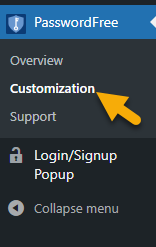
1. In your Admin panel, navigate to PasswordFree.
2. Click the Customization page.
3. The following settings are displayed.
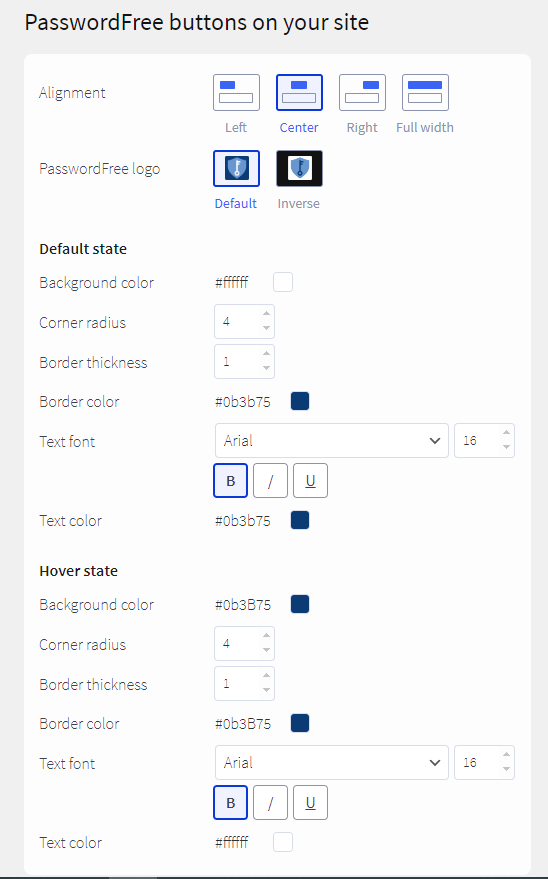
1. Initially, the settings on the Customization page have default values.
2. The incorrect values are highlighted in red and the Apply button is disabled.
3. If you leave any field empty, the "0" value is automatically displayed in this field (the “#FFFFFF” value for color fields) and the Apply button is available.
4. To customize buttons, update the following settings.
- Alignment: choose how the buttons are located in your registration/authentication forms.
- PasswordFree logo: choose between the default and inverse logo.
You can customize buttons in both the default state - when the buttons are not interacted with and the hover state - when you hover over them. In either case, the following parameters can be customized:
- Button background color: perform one of the following steps: enter the Hex color code or select the required color from the color picker.
- Button corner radius: change the default value to your liking.
- Button border thickness fixed in pixels: change the default value up to your liking.
- Button border color: perform one of the following steps: enter the Hex color code or select the required color from the color picker.
- Button text font: select the required font from the drop-down list, specify the font style: Bold, Italic, or Underlined text, and enter the font size.
- Button text color: perform one of the following steps: enter the Hex color code or select the required color from the color picker.
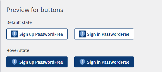
5. The changed parameters are displayed in the Preview for buttons section of the page.
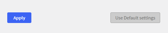
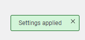
6. To confirm your updates, click Apply.
7. The following notification is displayed.
8. If you want to discard the changes, click Use default settings. The following notification is displayed.

9. Click the Apply button and the default settings shall be used again.
10. If you haven't saved the updated changes with the Apply button and try to leave the Customization page, the following notification is displayed.
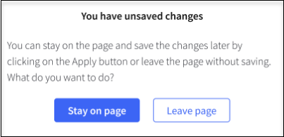
11. To return to unsaved changes, click Stay on page and click Apply. To discard the unsaved changes, click Leave page.